“I, Mii, Mine”
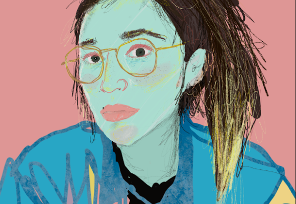
One of the first paintings I built up by adding mediums to my paint, resulting in the softer color shifts on the face and hair.
When I saw Ashley Anderson’s paintings for the first time, I reverted to my 6-year-old self. I was excited to see those familiar pixels and colors transformed into exciting pieces of art. His work is often chaotic and loud with its colors and asymmetry—yet others are simple and put together. His medium changes depending on the exhibition or outlet—from computerized images to acrylic. Since moving to Atlanta in 2007, Anderson’s artistic self has grown with the city, from collaborations with Fallen Arrows and exhibitions across the pond to his first solo show at the Emily Amy Gallery. Lately, it seems he’s everywhere. At any given time, Anderson has a piece of artwork in a show, festival or publication somewhere in Atlanta.
Here, CommonCreativ talks to Anderson about childhood video games, watching the city grow, getting to know himself as an artist and how humor plays an important part in his work.
CommonCreativ: 2012 was a big year for you! You were featured in a Finland art show, Wired UK magazine and your first solo exhibition. How have you grown as an artist?
Ashley Anderson: My idea of what’s possible has been greatly expanded. I think I’m still processing the reality of these opportunities. I imagine it sounds weird to say that, but when I’m making the work, I’m not usually thinking of where it will be shown—much less how accessible some seemingly remote venue might be when the time actually comes. Working with the Teletext show, where all the work is specifically made for television broadcast, has reiterated the importance of the motto “begin with the end in mind.” I’m trying to think more about, “Where do I want the work to be shown, and how will that inevitably affect the content of the work?” I want to be more thoughtful about what I do and how it’s presented.
On a technical level, I’m finally integrating materials testing as part of my process. For the longest time, I was willfully ignorant to things that could have made my work less daunting. First and foremost would be acrylic painting mediums, especially as it relates to glazing color. There really is no substitute for adding medium to your paint to make color more subtle; thinning with water dulls color and weakens the paint film. It blows my mind how many artists I’ve spoken to had no idea about using mediums. It truly makes worlds of difference.

“G’oil” (left) + “Leaving Los Angeles”
Paired to demonstrate the relation of my approach to the show with the Chuck Close quote about working in a series.
As someone who almost always works alone, I’ve been educated in the last year on the tremendous boost that comes from people advocating for me. It can be as simple as my fellow artists Max Capacity and Prosthetic Knowledge bringing the Teletext show to my attention, or as complex as the folks at Young, Foxy, & Free printing a poster I designed and distributing it far and wide. There’s the jaw-dropping amount of work put in by the Emily Amy Gallery to promote and sell the work I made for Shinobi Marilyn. Emily West is Superwoman, a fairy godmother and Leo Castelli rolled into one; she’s a total badass and has made a huge dent in my career.
CC: What’s your thought process when choosing a theme and media for your shows?

“In One Snack Bar and Out the Other”
AA: Because Shinobi Marilyn [shown at Emily Amy Gallery] was the first real, in-depth series I made, I must admit I’m still establishing my thought process. Until recently, I couldn’t see the point of working in a series, but I was also frustrated with only making single images and not getting satisfaction. Then I came across this Chuck Close clip on SFMoMA’s incredible multimedia archive. Essentially, Close says using a given image only once doesn’t bring you any closer to understanding what draws you to that specific image. However, changing your approach to a single image across multiple artworks fills out why you do what you do. It also usually leads to work you wouldn’t have thought of otherwise. Once I heard this, I understood the worth of working in a series. I then set about contriving as many ways of building images as I could. I made gel transfer prints, solid gold paintings, digital collages, drawings on plastic, even an animated GIF, using the same nine images of Monroe as starting points.
CC: What connection do you have to vintage video game imagery that makes you choose it as source material for your art?
AA: I originally used the imagery in a symbolic fashion—substituting characters and situations from games for Herakles, the Destruction of Sodom and Gomorrah, or Rublev’s Ikon of the Trinity. Once I was out of school, my focus gradually shifted to more obscure objects from games to suggest connections between the structure of pixellation and the mechanics of seeing and understanding any given painting, which then lead to using the images to relate to art history, consumption and the object-ness of art.
At its core, painting is various shapes of color smeared on a sheet, but our ability to decrypt (or not) these smears determines whether the work is representational, abstract, or anything in between. I think the exact same thing happens with pixellation, especially with game imagery up to the 16-bit systems such as the Sega Genesis, Super Nintendo, Turbografix 16, PC 98, etc. If you make an honest attempt to sidestep the reading of a video game graphic and see it in terms of its constituent color shapes, the readable image falls apart. I love that! You can actually see yourself unseeing the image!
Something funny happens when I show the images to people either too old or too young to remember the kinds of games I’m pulling from: They have a hard time decoding the painting. It’s interesting because in a way they have access to a purer experience of the painting. They have no point of reference, no instilled graphic vocabulary because either they never played video games or their first system was a Playstation or a Nintendo 64 and primitive graphics were never part of their experience.

“Memory Beach, Part 3”
CC: Let’s revert to childhood. What video game would 8-year-old Ashley play after school?
AA: Okay, so that’s around 1990. Ducktales for the NES by Capcom was a beautiful game, I still bust it out on the emulator every now and again. I also had Mickey Mousecapade, put out by Capcom but actually made by Hudson Soft. That game was slightly horrible but still playable, and has one of my favorite images of cake from a video game. That’s one of my favorite images to repeat since I have a really visceral reaction to that graphic, and I love Wayne Thiebaud’s paintings.
CC: Describe your art style. What are your favorite materials to work with?
AA: For painting, I prefer acrylic because it doesn’t involve the solvents or intensive clean up one runs into with oil, and I don’t have to worry about the “fat over lean” calculations that concern oil painters (I respect anyone who can handle that, though). I love drawing with ink wash, and while I will forever love drawing on paper, I’ve recently discovered how to draw on sheets of plastic, and I love how uncontrollable it can be. So far I’ve drawn on yupo, duralar and styrene, and I love each equally for their different effects. When you remove the variables of absorbency and rapid drying from drawing with wet media, it becomes a whole different kind of fun. I also do a lot of collage on the computer; for instance, my Memory Beach series and the designs I made for the Billboard Project back in October were made entirely on the computer.

Teletext Festival — “Help and Glass”
CC: You’re involved with Fallen Arrows and made some t-shirt designs. How is it different from your regular art?
AA: My output is rather cleanly divided between the pixellated work and completely non-pixellated, hand drawn work. The former are where I address specific ideas, the latter are just fun. My pixellated images are intended to sit in galleries while my hand drawn images are better suited for shirts, animation and zines. For a while I was struggling with my identity as an artist splitting between the two, and I still do to some degree. I thought about combining them, but it always looked like total crap, so I’ll keep them separated for now.
CC: Where do you find your inspiration?
AA: Humor is huge for me; given a choice between a somber image and a funny image which both say the same thing, I’m going with funny every time. I remember hearing someone refer to my work in college as having a lot of humor and mentioning there’s not enough of that in art—and I’m glad to be the funny guy, just as long as the joke is thoughtful. The opportunity to make something no one else has thought of is very exciting. Conversely, making something plenty of people have thought of but never had the will to make is also fun. I’m inspired by the opportunity to talk to artists I respect, too. When you make work in the studio, you are in direct conversation with artists you may never meet. No one stands between you and them in that respect. It’s great.
CC: What are your favorite projects in Atlanta right now?
AA: Organizationally: Dashboard Co-Op, Living Walls, and WonderRoot. Individually: Jiha Moon, Andy Moon Wilson, Craig Drennen, Nikita Gale, Sean Abrahams, Jason Kofke, and Chris Chambers. Plenty more where that came from, too.
CC: What’s next for you?
AA: Doing a portrait painting for my dad’s church; finishing a mural in a home in Decatur; organizing imagery for several different series of pixel works (signs, flowers, portraits); coming up with a new zine; finding some shirt companies to work with; hopefully learning how to apply for grants; getting some freelance illustration gigs; prepping for Artlantis and the Atlanta Zine Fest.
CC: What are your thoughts in Atlanta’s current art scene?
AA: I’ve had this conversation with a lot of people lately. I moved to Atlanta in 2007, which was pre-WonderRoot, pre-Dashboard, pre-Living Walls, pre-Glo, pre-Flux and plenty of other stuff. And then WHAM, everyone’s doing stuff. That’s in a period of five-and-a-half years. That’s insane—good insane. And we’re all still very much learning what each of us does, galleries are closing, capital is moving around, new artists are constantly showing up, communities are reacting—there’s whole lotta shakin’ goin’ on. Beats the hell out of how it was when I moved here and it’s a light years better than what little was going on in the last city I lived in. Keep going everyone, and bless the haters as you climb over them.
Check out Ashley Anderson’s new line of t-shirts over at Fallen Arrows here.