When asked what makes a good design, artist and designer Staci Janik likes things that get her attention.  With her trained eye and striking use of typography, she’s been hired by restaurants all over Atlanta to build their brands. Her designs catch the eyes of foodies far and wide by successfully managing the balancing act of saying a lot without saying too much.
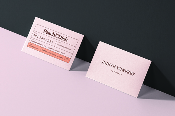
Janik made the move to Atlanta to pursue design at the Atlanta College of Art, prior to its merge with SCAD, and later at the Creative Circus. Since obtaining her certification in 2010, she’s had a six-year teaching stint there, and took a hiatus to take on freelance design opportunities within the food and retail industries full-time. To date, she’s worked with clients such as Bread & Butterfly, Cooks & Soldiers, and Kimball House, all while maintaining a long-term relationship with meal kit delivery brand PeachDish. With these businesses, she works on projects encompassing everything from apparel to advertising.
Here, Janik talks with CommonCreativ about how she got involved with the food and retail industries, what she loves about typography, and finding inspiration in something as commonplace as words.
CommonCreativ: What sparked your interest in art?
Staci Janik: My interest in art started very much with words and the way words and letters look. I remember being very curious in a naive way about signage, especially in my small hometown, because the signage was mostly cheaply made and terribly designed, and I wanted to know why. I came from a blue-collar family, and in the formal sense, design, especially graphic design, wasn’t a part of my vocabulary when thinking about visuals. I did draw a lot, and I mostly drew letters.
Throughout high school, I was in charge of visual merchandising at a local department store. There was this floor above the store that was full of every possible prop you can image, from gilded mirrors to hat boxes and all kinds of crazy sculptures. Often, if I was going to put up signage, I would have to manually kern [which means to adjust the spacing between letters or characters in a piece of text to be printed] words from the large wooden and foam letters. I didn’t realize these qualities were technically in the realm of design and styling at the time.
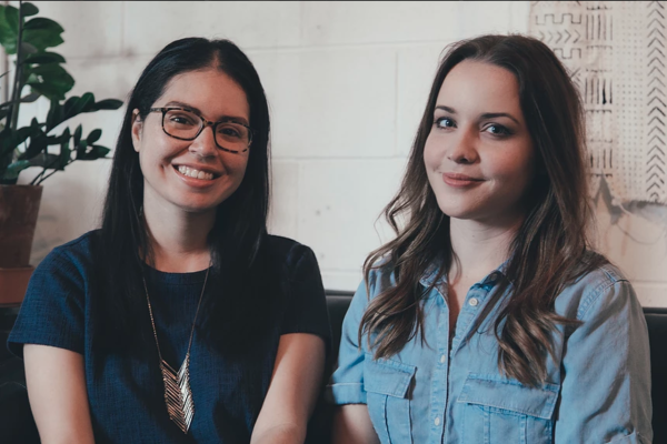
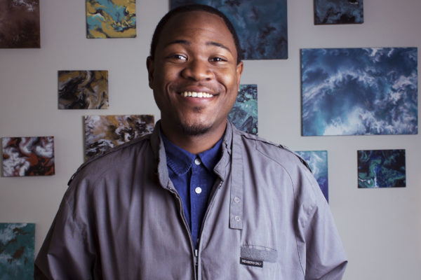
Staci Janik | andrew thomas lee photography
I didn’t formally begin studying art and design until my 20s, after a stint in the ophthalmic field — which means I worked with eyes and vision. This was really relevant, and the skills I learned proved invaluable. I worked for a surgeon who was also a pilot with pretty high standards regarding checks and balances during procedures, so I’m used to being in high-pressure environments, paying attention to details, and maintaining a high standard of order. Working in the field also gave me the advantage of familiarizing myself in the science field, which is so full of natural systems that designers should aim to replicate.
CC: How did you get involved in the food and retail communities?
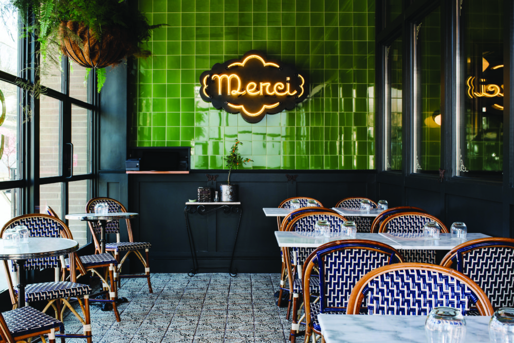
SJ: I met a bunch of young and local farmers through friends in my early Atlanta days. At the time, they were starting to supply a few Atlanta restaurants with their food, and I thought it was wonderful. I met a lot of people through that specifically, and although I worked in food service for only two very brief years when I was in school, I developed a love for the community of people I met who were all actively involved in growing delicious, locally grown, sustainable food. These were my friends and some of the first people to come to me for design needs, so my involvement has just grown from there, and now most of my work is restaurant, food, or farm-related.
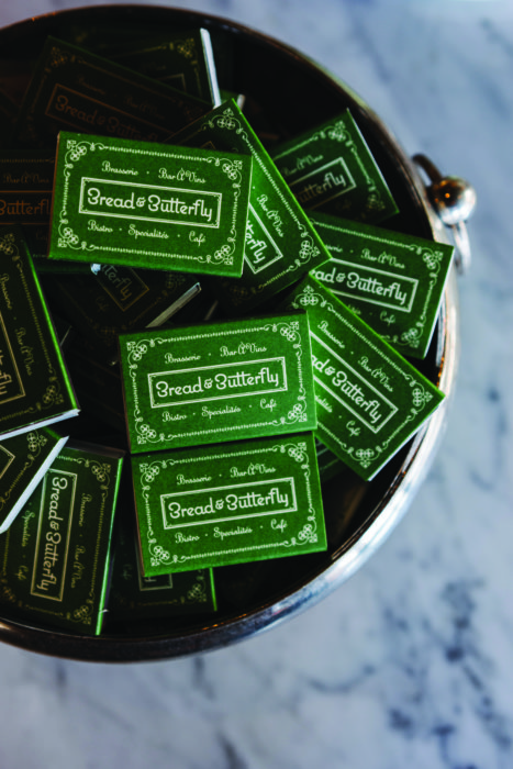
bread & butterfly | andrew thomas lee photography
CC: Describe the style of your typography designs and how did you developed it.
SJ: Clean, intentional, balanced, fresh. It’s evolved over time. I’ve worked with and around a lot of really talented illustrators and designers, and I think creative people have a natural tendency to emulate others until their own voice emerges in their work. So for me, the development has been centered around changing and adapting to include visuals and styles I’ve been inspired by and over time perfecting the things that work and discarding the things that haven’t. My hope is to do work that is bold and fresh but never showy. I don’t want to be kitschy or overbearing and I try to show some restraint — even when the work is fun or totally weird.
CC: What do you love about typography?
SJ: Typography for me is an exercise in balance. The balance between clarity and ambiguity or symbol and signifier often depends on the way the typography is used or how it’s created. I like applying some control or concept to the artistic expression. It’s one of the simplest ways to convey a message. Type is a vehicle.
CC: What inspires you?
SJ: Words. I read a lot, and it’s good for the imagination. Stories often spark ideas and momentum. I love office supply stores and hardware stores. I have to make a list to go into either, otherwise, I’ll lose the plot and start brainstorming on things I can make or what needs to be organized. Perhaps this makes me neurotic, but I believe you can’t be a good designer without being slightly neurotic, and I know that organizing and cleaning is a way I like to work through my thoughts. I love collecting paint swatches, and a good record is always helpful when I am doing any kind of production work or preparing files for hand-off. Travel is restorative and motivates me, as well as being outside or near the water.
bread & butterfly | square feet studio | andrew thomas lee photography
CC: What’s your process for developing new branding for businesses?
SJ: I usually start really abstract and get more and more granular. I always start a project with a conversation with the client — it is nice to hear what they might be inspired by, what the story behind their concept might be, and anything else they feel like sharing. I also like hearing about things they might like or dislike regarding restaurant design in Atlanta. Communication and inspiration come first. Sometimes an idea might start to materialize in my head that I haven’t figured out how to articulate, but as I research and make a lot of notes I begin to outline my thoughts. Usually, I do sketches to get things out of my brain and onto paper. Once I feel like I have several solid ideas, I move on to refining things. So the short answer is that is starts at a loose design stage, and then I transition to narrowing in on the final directions, and finally, I tweak the designs until they’re just right.
CC: How do you promote yourself?
SJ: Mostly word of mouth and having enough work in the public sphere. I’m actually bad at promoting myself.
CC: What projects or achievements are you most proud of as a designer?
SJ: It’s hard to narrow down to specifics, but I can say that the projects that are the most redeeming are the ones that allow me to collaborate but with a free and open mind. When I feel trusted to do my job, I am the most proud.
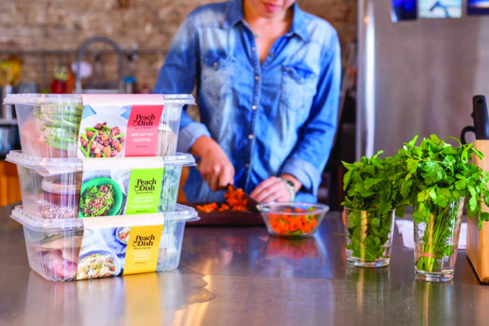
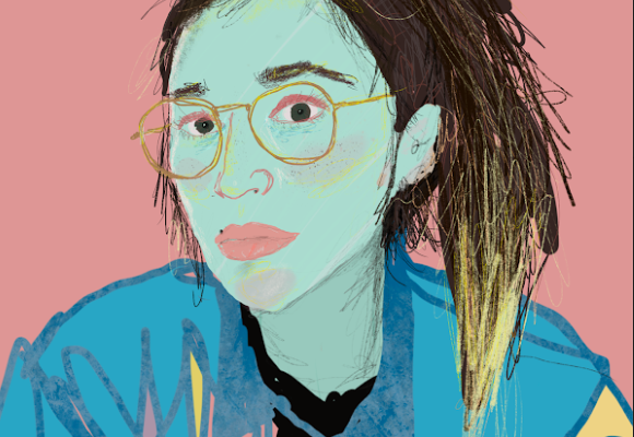
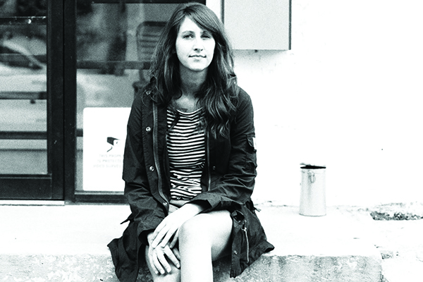
Photo by Kate Blohm
CC: What are your thoughts on the local arts scene, and what are some of your favorite artists and art organizations in Atlanta?
SJ: ArtsATL is a good resource for keeping up with news and events. Sandler Hudson, Jackson Fine Art, and Hathaway are all great galleries, and I really love Whitespace — such a lovely space.
CC: What do you currently have in the works?
SJ: I have quite a few projects right now, including Watchman’s Seafood and Spirits, the new concept from the team at Kimball House, which will open in Krog Street Market later this spring, the Decatur Craft Beer Fest, the ever-growing PeachDish, and another very exciting restaurant concept that I can’t dish about publicly yet.
See more of Staci’s work on her portfolio site, Instagram and Twitter.